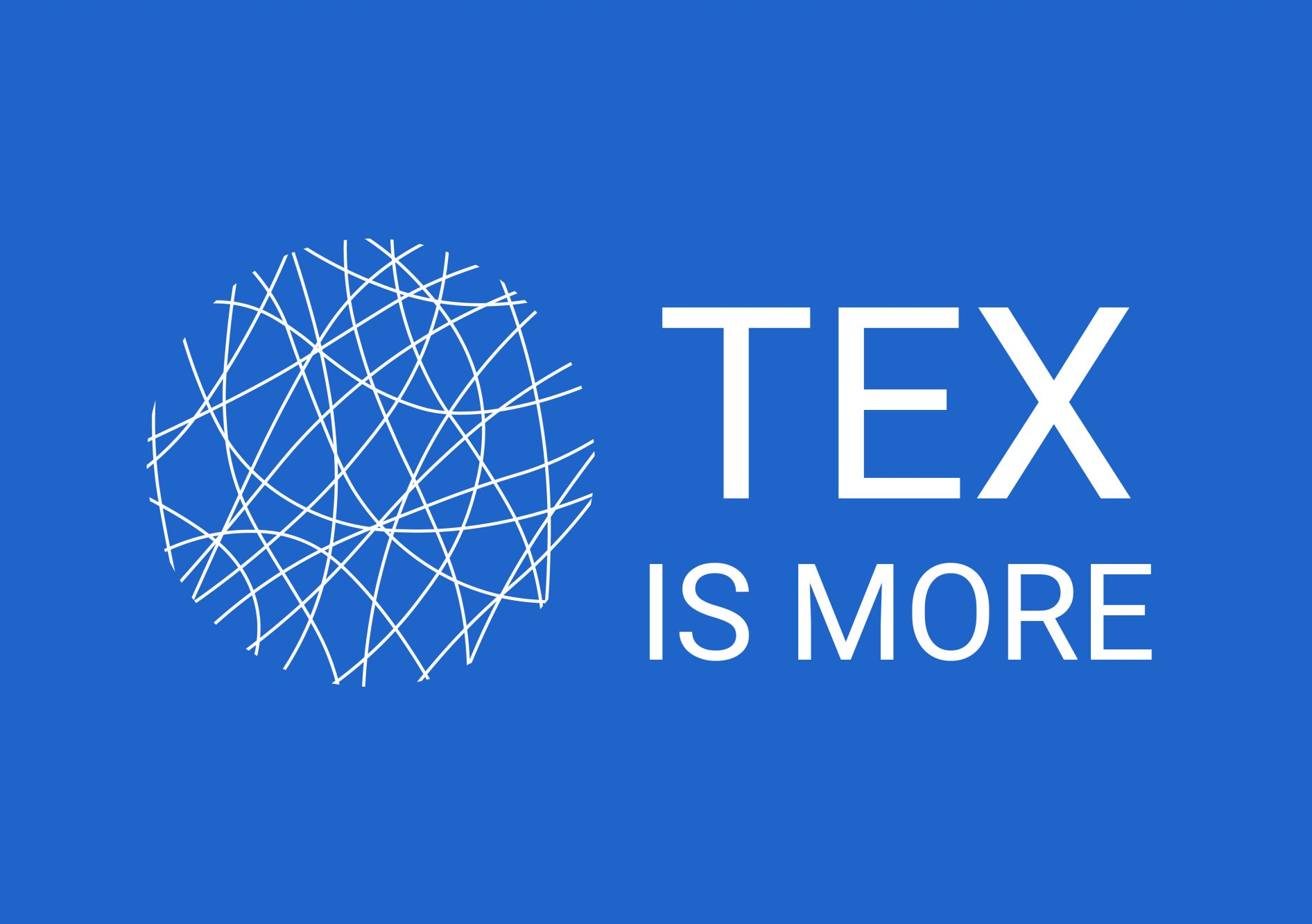
Our house style and logo
The story behind our house style and logo
Fibres are the utmost smallest but at the same time most universal representation of textiles.
Whatever type of textiles, at its origin, there’ll always be fibres. Whether these are natural or man-made. Whether it’s in a yarn, fabric, textile based composites,… somewhere, somehow any textile started as fibres.
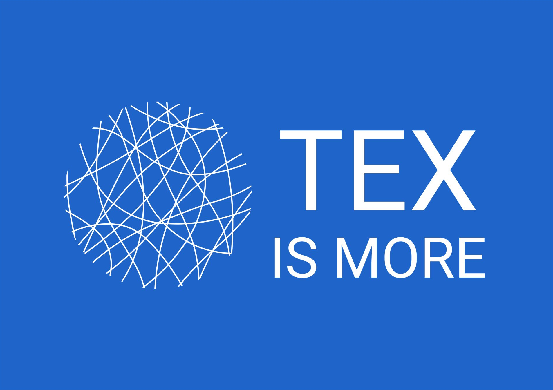
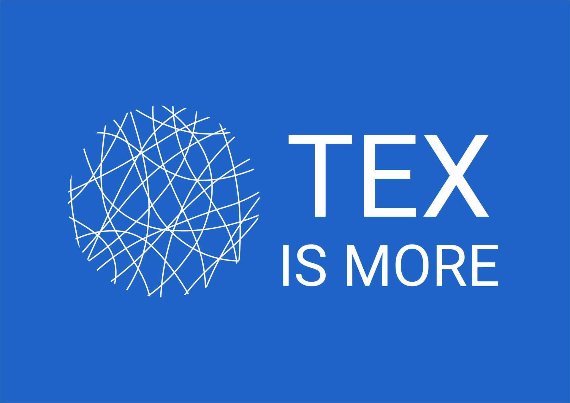
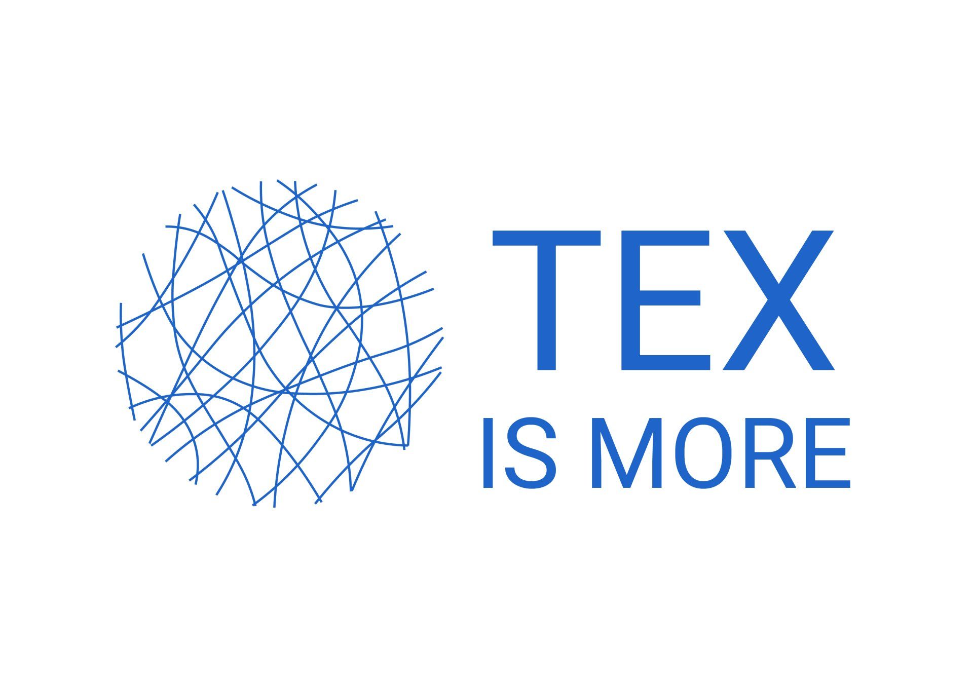
FIBRES CONNECT!
That's also why we have chosen a visual representation of fibres for our logo. They are blended and connected in a circle.
Let the circle evoke itself what it stands for. If anything at all?
Looking through a microscope to symbolize research?
Closing the circle, not only in what we do and how we act but also from the broader sustainable perspective protecting our globe?
Our name TEX IS MORE and the fibres proudly stand side by side. Strong and clear! Just like we communicate in a clear and transparent way.
Our font is called ROBOTO. We have chosen this because of the same reasons of strength, clarity and readability.
The blue color finally refers to our home: Ghent University within the Ghent University Association.
We run both versions i.e. with the blue or the white background as we do like some variation in life.
Which one do you like most?
© 2022 TEX IS MORE